RESEARCH LINK:
1:http://www.moddb.com/groups/cryengine-2-developers/tutorials/cryengine-flowgraph-tutorial
a very detail introduction about flow graph and how to use some simple methods.
Analysis engine brief:
The feed that I have found is about the relationship between space and light which the lit floor is depending
on amount of people. And the analysing by the flow graph shows how distance changes when the character moves around the map, it also connect to the space,the space can be changed by the moving restrictive walls or the intensity of the light.
2011年11月10日星期四
EXP2_WEEK2_TASK
flow graph with comment :
part1:
part2:
analysis video:
flow graph link:
this website is a tutorial which describe how to make an AI character walk and through this process to analysis AI.
2:
this picture shows how the flow graph work when we are doing flow chart analyzing,
EX2_WEEK1_INDEPENDENT STUDY
"The sense of space is created using light. The number of people entering and leaving a room directly correlates to the floor area which is lit up. As more people enter the room the lit floor area increases. As more of the floor area lights up the concept of a larger space is created."
SWOT analysis:
Strengths:
The description of this feed has great expression of the relationship of space, light and people.
Weaknesses:
without the arrangement of the luminous intensity of the light, it's hard to work out how the luminous intensity of the light effect the space and this pachube feed could have more attention to the relationship between light and space, and do not explain to much about space and the floor area connect to each other.
Opportunities:
The way to take advantage of this feed is party with increasing amount of people. The requirement of space when the amount of people increase would exceed, and after analysis the relationship between light and space, then we can control the space by changing the luminous intensity of the light.
like in a concert:
image source:http://upload.wikimedia.org/wikipedia/commons/5/50/Zdravko_%C4%8Coli%C4%87_concert_-_Spaladium_Arena_-_light_show.jpg
2011年10月26日星期三
2011年10月23日星期日
WEEK12-500 WORDS
the round house
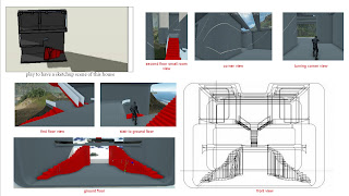
My re-designed building was named the Round House, it is located in a small holiday island and have a great view of ocean, the building is design for a art gallery. so it have lots of windows and most the space aren't closed but has significant privacy of protected art. There are three levels and each level has different function to each other.The Round House is named round not only because of the shape but also the spiral circulation.
Each level has different view of environment.The first level is a car parking but it is small and just can park few cars.There are two ways to get second level by the stairs which are three quakers of a circle twisted. After enter second level, there is a small coffee place, with big windows facing the mountains, and a stair up to third level is right in the middle of the balcony in side of building in the second level .
The third level is the main of the gallery, it is a "U" shape space which is deviled by two walls in the middle and two rooms are opposite to each other and the don't of the room is round to reduce the danger of hitting. the largest room is right above the coffee space and also has a big window, and there are few small windows in the ceiling to have outstanding shadow effect. There are also two ways to get into level three ,The ends of stair are connecting with two small rooms to have the circulation be spiral.
My default building is Klein Bottle House, it has amazing odd sharp surface and cause the inspire of Klein Bottle, the surface can be inside and the inside also can treat as surface. And for the circulation , there is a stair in the middle to connect with different levels makes people walk around the house as a circle. The resemblance between two house is similar spiral circulation and the color contrasts is familiar to default building.
My design is inspiring from the circulation of the house, the stairs has effect of the circulation and make different loops for visitor to have novel visiting experience to the house, and have diverse scenes of sightseeing, for a gallery, the space need to be high than standard room to provide visitor a joyful trip.
Then the function and shape of my re-design building are totally different from my default building, and I have search for his design projects, there is no connecting between two projects, all the projects are designed to be suitable for different functions and environment. They can have odd surface, same shape but different size hole in the wall to make the light have shapes. Back to my re-design building, as a gallery, it provide privacy and nature lights, muiltifunction spaces to entertain, visit and rest. What I have learned from this progress is convertting digital media to real world need to consider about much more factors.
2011年10月16日星期日
2011年9月25日星期日
week9-independent study
image credit and reference:
For my first chosen building's concept - circulation, it's spiral around the house, it would be better to contain with a museum, a spiral circulation will let the visitor comprising everything in sight and hollow shape in the middle is which the stairs in the different stories around but end to end. In the plane view of my re-design building the three stairs in the different position will form a circle.
And for the connection of my chosen architect, most of his design buildings are with odd shape windows and can be exist in two stories. And there are also decks in different position in the different stories opposite to the stairs to have lights but the decks are also inside of the building from the idea of klein bottle house.
The main color theme of my re-design building is modern and cool tone - steel and which to make a great effect to my building and the theme.
2011年9月24日星期六
WEEK8-independent study
This house is located on sand hills adjacent the ocean beach in Rye. This strategy has unlocked a new series of relationships and sequential spatial experience. It got three level crisscross orderly and start from the foryer, and revolves around a central courtyard, and there is a U type stair connecting all the levels, since it is inspired from klein bottle, then it is a building which is like a endless curling shell.
There are also some shortages of Klein bottle house, like the amount of normal materials neccessary, ended up with half the livable space, and the bunch of slanty walls and ceilings make for a very disorientyny experience.For my re-interpretation building, I'll simplify the surface and reduce the angles. The spiral shell circulation will be retained for my final design.
2011年9月18日星期日
2011年9月11日星期日
MID-SEMESTER BREAK INDEPENDENT STUDY
four people group:
choosing building:
Architect: McBride Charles Ryan - Rob McBride & Debbie-Lyn RyanLocation: Mornington Peninsula, Australia
Project Team: Drew Williamson, Fang CheahClients / Builders: Donna & MarkConstructed Area: 258 sqmPhotographs: John Gollings
Project Team: Drew Williamson, Fang CheahClients / Builders: Donna & MarkConstructed Area: 258 sqmPhotographs: John Gollings
The Klein Bottle house express the new spatial relationship and configuration, and before building this house, modeling technology plays an significant role to comunicate designer's idea and it also can model much more complex shape, and for this building, it was full orthoganals and has great communicatin of plans, sections and elevations.
This building is located in on heavily ti-treed sand hills and has great viweing place of ocean beach in Rye. Because of the complex topography, it's strategy as a rectilinear patform and makes this house a abstract geometry inhabitable
2011年8月21日星期日
2011年8月15日星期一
WEEK5-POSTER AND ANALYSIS AND POSTER GRID

Ram Koolhaas' poster with good layout and organized font size
The success point of this poster is attractive. The upside down portrait painting can catch viewers' attention easily. This poster is used to inform people about a presentation. Thus the layout and the typography are strong focused with different size. And the more important information was used darker color to express the importance.
The "OMA" letters are transparent to avoid the unmatched visual to the portrait painting. And the other "AMO" letters which in lighter color make "OMA" in symmetrical poster won't be so abrupt. Hence to create a visual illusion that both site have "O" and "A" in same color.
The reason why the upside-down portrait painting isn't make a donation of strange is that it's only show half face with eyes clearly and also in the same color scheme as texts. The other reason is that in the event of putting painting in the right way, the main part of human face- eyes will be hide after texts, therefore, the poster will be fail to others.
In conclusion, this poster creates strong and pitched method.
2011年8月14日星期日
WEEK4-reflection and poster draft

Ram Koolhaas' poster with good layout and organized font size
my poster grid draft
reflection
In this process, I have improved my software skill such as 3ds max and indesign, sketchup... and got better understanding of Ram Koolhaas and his work that done those years, what impress me most is his principle - well known to be different, as one of world most influent people, he can ignore what people say to his work and control his out come, defense what he is doing. Thus, my creatures can be as strange as I could to express my idea. And creating creatures and modeling environment by 3ds max are interesting and addicted.
Each week, we got every connected task; the connections of those tasks are so strong that we can’t miss any of them. And as a student that needs to prove our own imagination and organize our creative ideas, which is the main purpose of this course, I was pleased about that there is no such a fixed requirement about our creating staff. And for the model that I have created, I decided to develop a new one from old two special characters to maintain those elements.
Finishing assignment is not only learning how creates and model, but also learning from each other in this course, if I only doing my work and never visit others’ blog, I won’t be improving. Like using Build AR, at first, I don’t have any idea to start. And the inspire video really change my thought about Build AR, it’s not only present but also play around depending on how skilled I am, I also changed my presenting model because of this reason, I want to make this presentation much more playful and clearly.
What I need to complete now is a final poster and model, and what I have learned from this process is complete every little task will be easy for us to reach the great goal!
WEEK4-6marker
this is my first marker, all of my ideas are from Ram Koolhaas, so I chosed first letter of his
name to be the first step.
it is like endless cycle and my model is about continuing work , from different view of my work,
it will be like loops work again and again.
this aspect I use is to show details of my model, it's irregular shape and there is no front and back side as
one special character of my model.
another character of my model is interaction, even it is odd shape but they are very harmony and connect to each other but also can treat as independent model.
The model isn't only have shape as the first impression to others,
as what Ram Koolhaas insist is an architect should think outside of the box.
This is the shape of one of Ram Koolhaas's work- China CCTV headquarters, start knowing him and ends up with his work, this is what my first assignment about.
订阅:
评论 (Atom)


